Logo Designing
Designing a logo can be fun and challenging. You are looking for the right type of design to represent the business. This week I have been working on redesigning my logo. The business I have been designing for is my own, Brittany Reece Photography. I do a little bit of design, but my main focus is photography. A few years ago I designed my first logo. I wanted to communicate an old fashion, simple photography. I looked through different vintage cameras and chose a camera I wanted to work with. Then I focused on how to personalize it. I continued to simplify it through the last year and came up with a design that I feel really represents my business.
This past week I have worked on refining this logo to make it even better. I changed the font to become all caps on the Reece. I want this to work more effectively with the overall design of the camera. Also I wanted the shape to be not as odd. I took the black out behind the piece and then worked on making it more of a square instead of a rectangle here is my finished result.
I really like what this now communicated about my business. I feel the name is a bit more dominate because of the font choice. Also the bright red and black contrast well and help draw your eye to the logo.
A Second Choice
I also worked on coming up with a completely different logo this past week. The idea of putting aside the logo that has become apart of my name was really hard and I struggled leaving it and trying something new. I realized that I would have to go a completely different direction. I wanted to try something different but still with photography as the main idea. I began with sketching ideas that I had scene and how I could make it my own. Here is an example of some of the sketches I made.

As I was sketching, I really liked the idea of a circle and having a stamp on each of my photos.I liked the stamp idea to feel like I was putting my stamp of approval on each photo I produced. I decide this would be a great different type of logo. I then went into Adobe illustrator and began designing. I began playing around with different circles and placement. Here are some of my early drafts of potential logos.

From these three potentials, I really worked on developing the stamp and using design elements that would create something unique to my business. WIth colors I wanted a cooler color that wasn’t as loud as the first logo. I picked blues and grays to calm it down and have a different message. Here is the Logo I picked as my second choice.
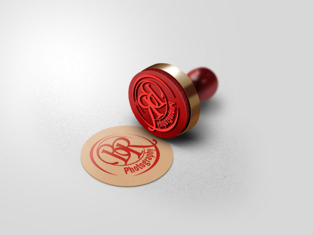
I chose a script font to make it more elegant and then a contrasting that is a lot more simpler. Here is a mock up of what this logo could look like.
I haven’t decided which logo I will ultimately use, but this stamp logo is becoming one of my favorites for sure.
