Blog
Engagement shoots!
Seeing Idaho
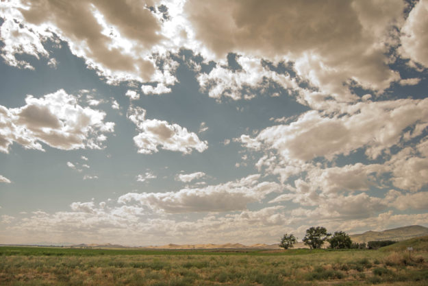
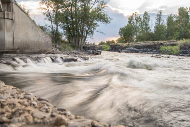
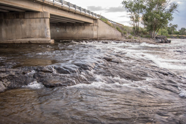
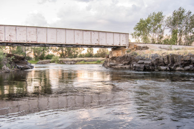
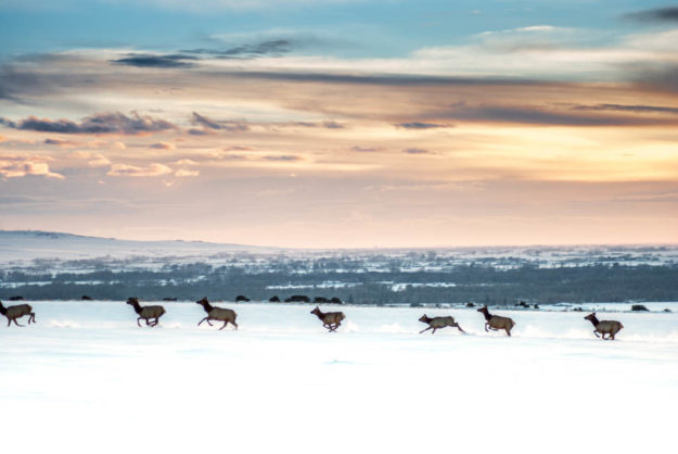
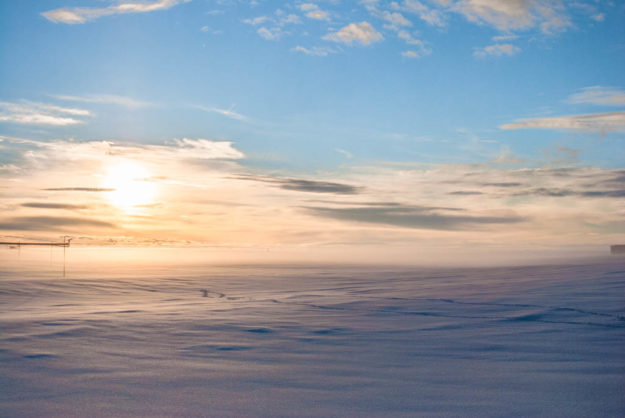
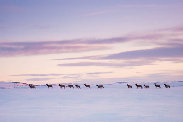
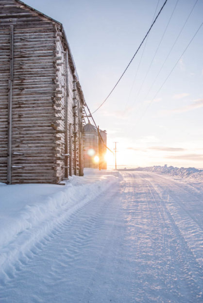
After graduating from BYU-Idaho, I received a job offer in Herriman, UT. I have lived in Idaho all my life and am a bit nervous to move away. So I decided that before I move, I want to take some time to see Idaho and take a lot of pictures to surround me when I am not living in this area any more. I have been taking trips after work to just go on drives and see what I could find. Here are some of my favorites.
Cress Creek
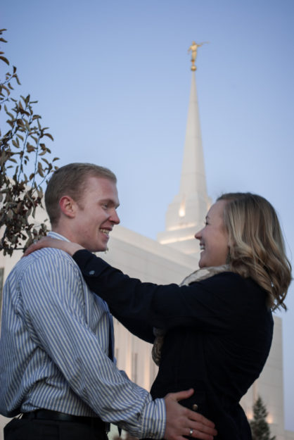
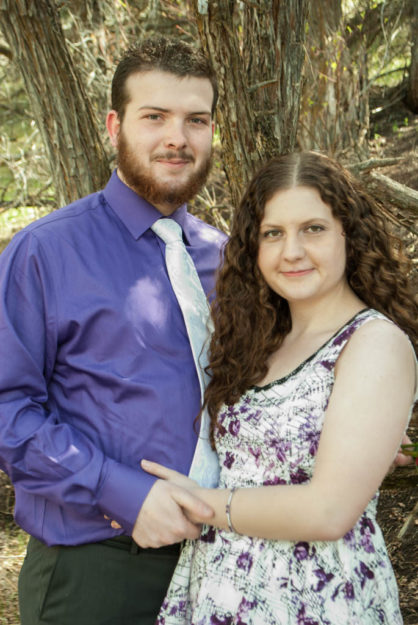
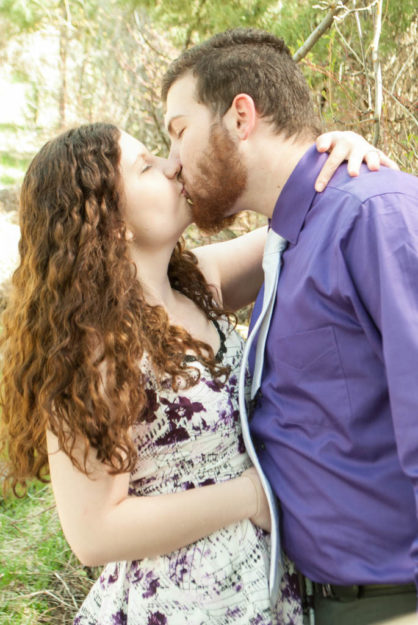
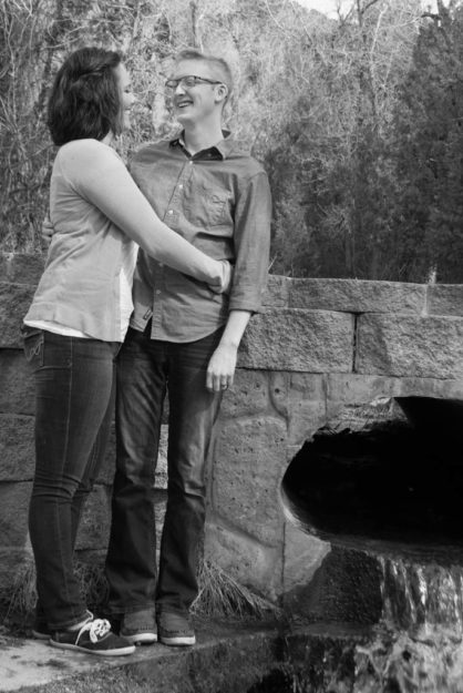
Engagements: Cress Creek
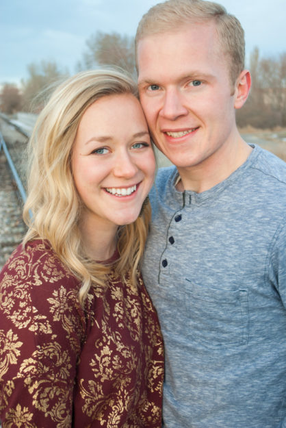
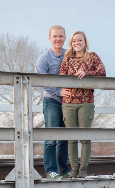
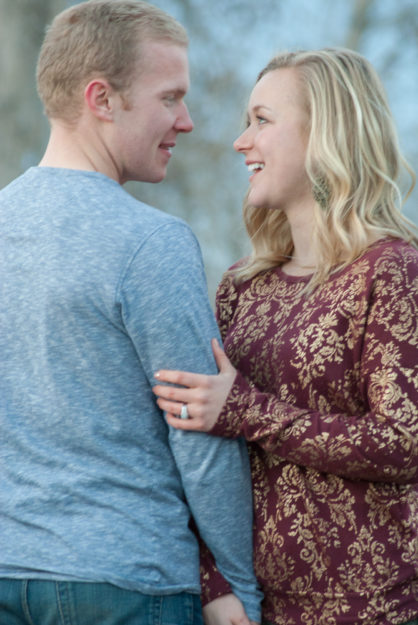
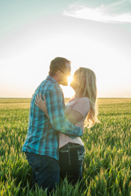
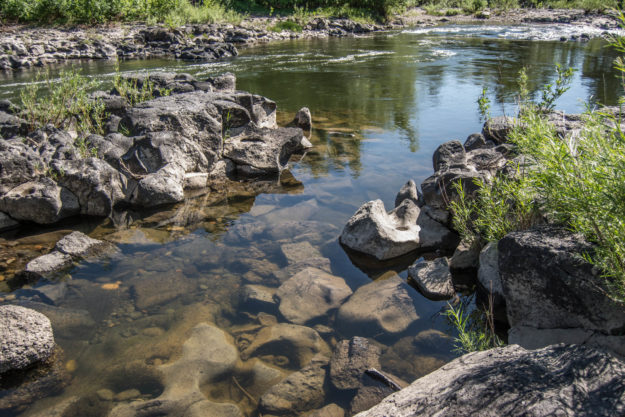
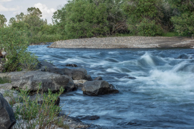
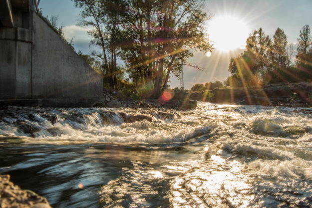
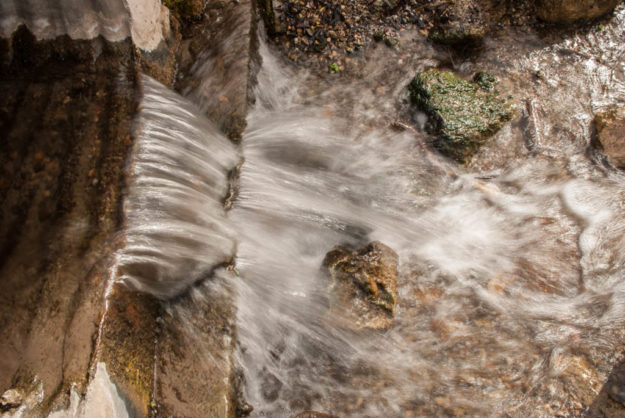
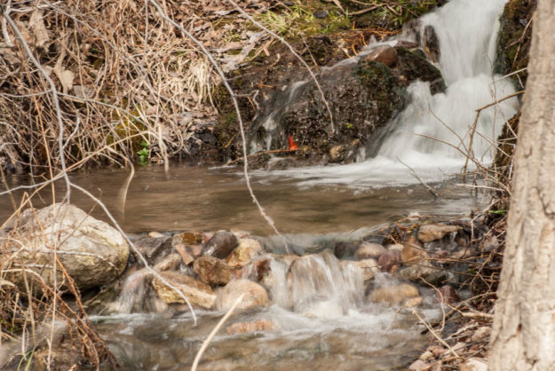
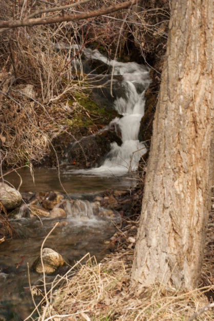
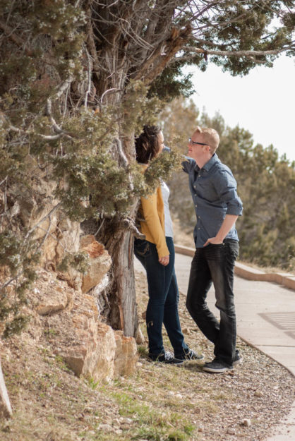
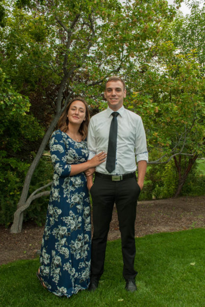
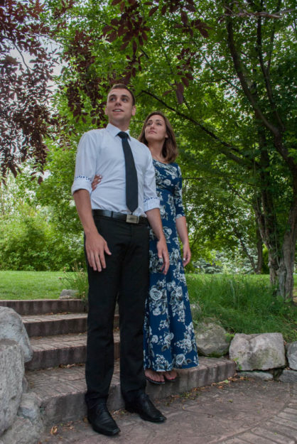
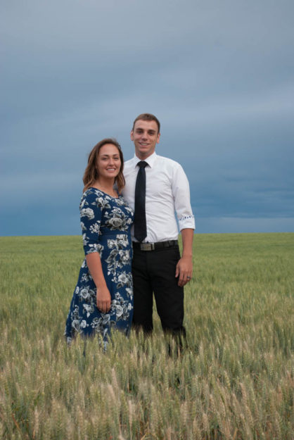
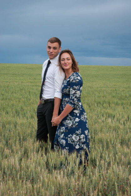
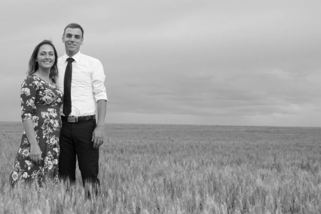
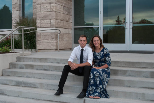
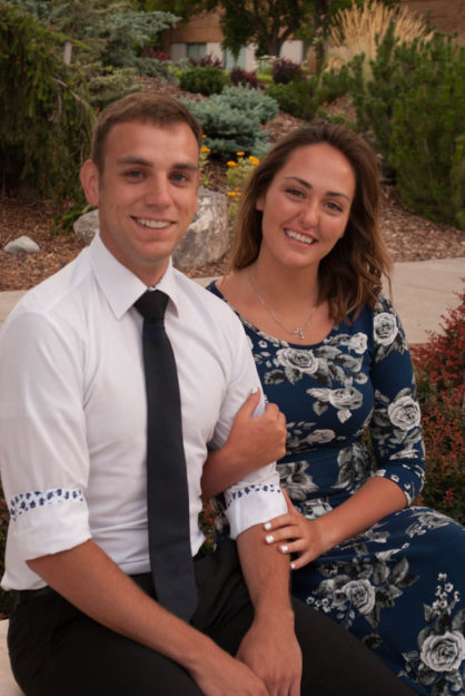
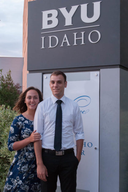
This weekend I had a engagement shoot. I was worried about where we could go and what kind of scenery we could get. I looked around a few different places and didn’t like what I was seeing. So the day before I decided to go on a drive and stopped at Cress Creek just to look around. The longer I was there the more excited I became about having the shoot there the next day. I had been watching the weather and hoping for enough light and no wind. Everything went so well! Here are a few of my favorites from the shoot.

Winter Photography
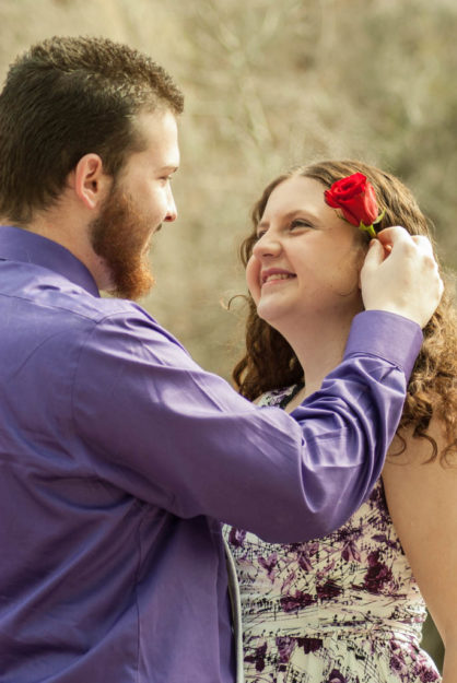
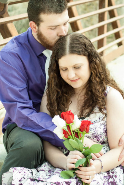
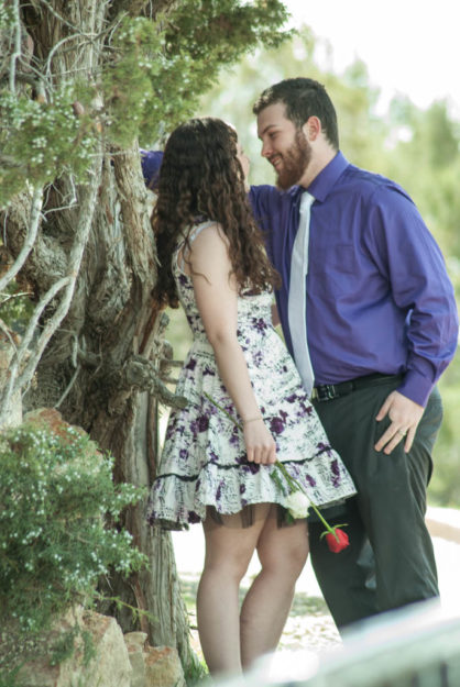
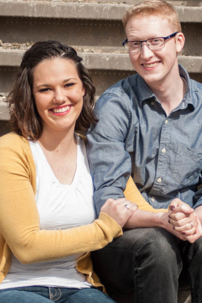
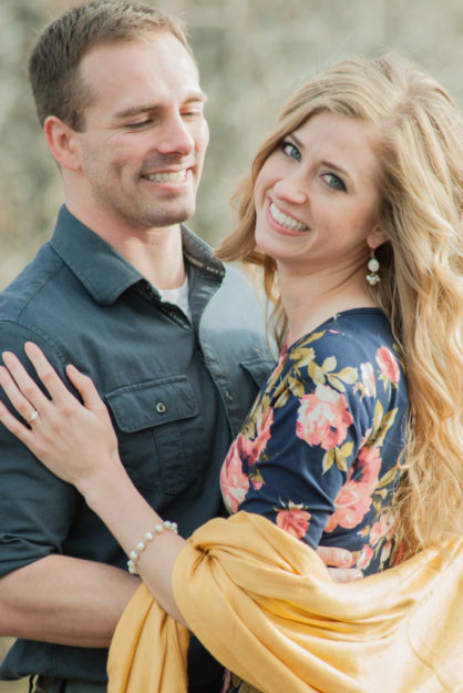
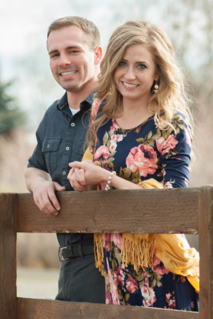
Zach and Heather Engagements
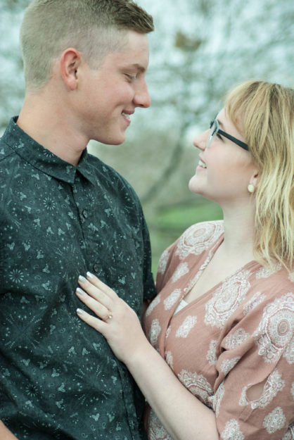
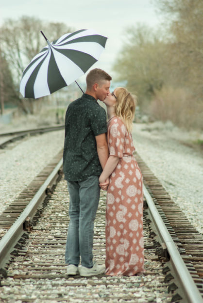
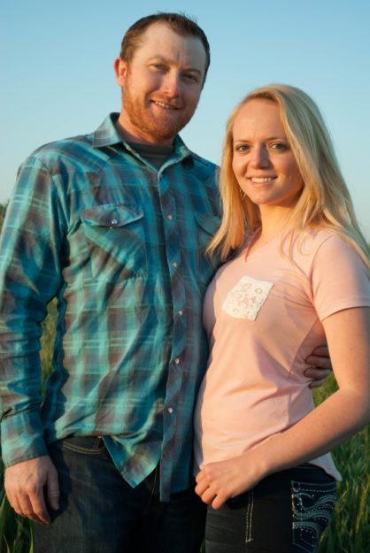
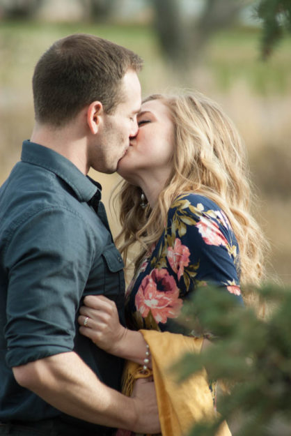
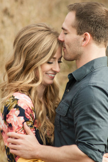
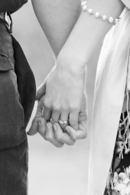
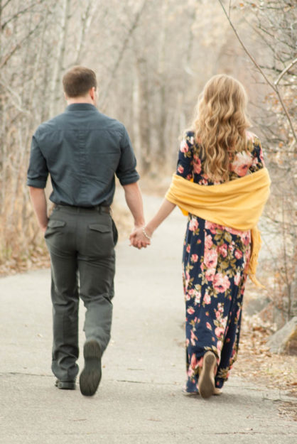
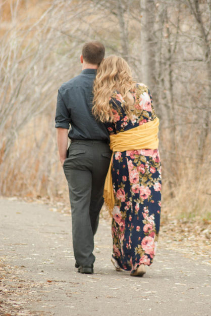
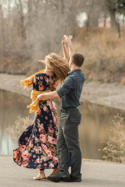
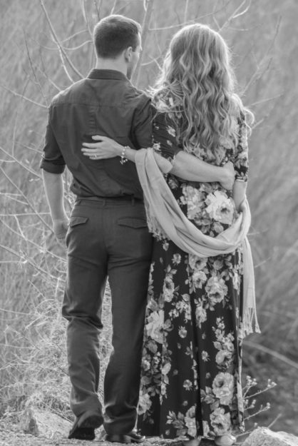
I recently had the opportunity to have a photo shoot with Heather and Zach. They will be tying the knot soon and they needed to have some photos done. The tricky part is Heather is living in Idaho and Zach is in Texas. We had a small window to go and take photos, and the weather was perfect.
Here are some of my favorites from the shoot!
Natural Ice Chapstick chapstick redesign
The Project
 Taking an existing product and creating a product redesign is a challenge. I didn’t know what product I wanted to do until I went to put some chapstick on. I then looked at my chapstick and started thinking through how I could improve the label and packaging. Here is the original packaging.
The Process
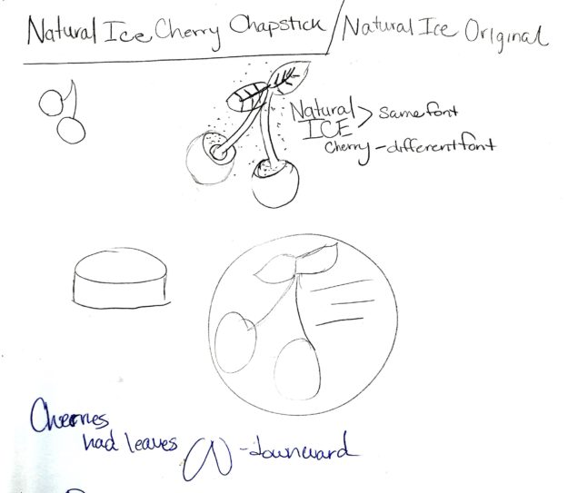
Beginning to think through this I began with sketching.
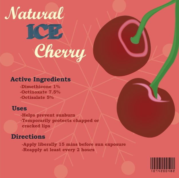
I knew at the beginning that I wanted to keep the cherries, but I wanted to clean up the colors and graphics by simplifying the overall design. I also wanted to change the packaging to a box with a short cylinder container. I also wanted to work on a different color scheme that would have more of a natural feel. Here is my design concept.
Fronts
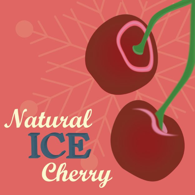
I wanted to create an interesting contrast between fonts. I chose Bookman oldstyle for the ice and body text and for the contrast with cherry I added in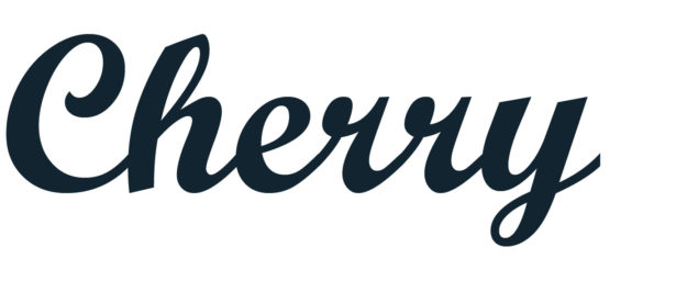 a readable script font called script MT. I wanted the ice lettering to give the feel of ice. I worked through a few different letters. I tried block letters, a white drop shadow behind the letters, and finally just decided to have a simple sans serif font bolded.
Color Scheme
Using color.adobe.com I looked for a muted cherry color type to help with the natural look. Here is a sample of the color scheme I chose.
The first draft
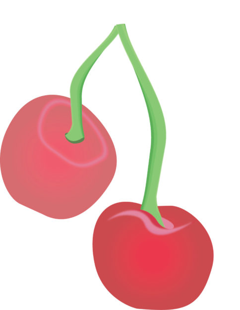
Here is my first layout of the cherries with and font. The feel was too complicated and I wanted to simplify it more.
Here is my first print up of the design in simplified form. Working through a few more design rules, I wanted to have the overall appearance to standout more.
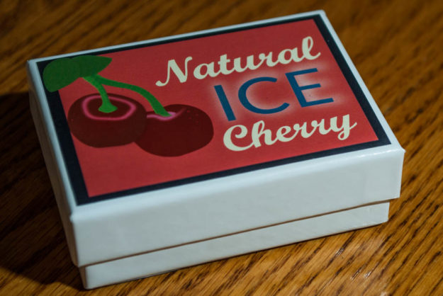
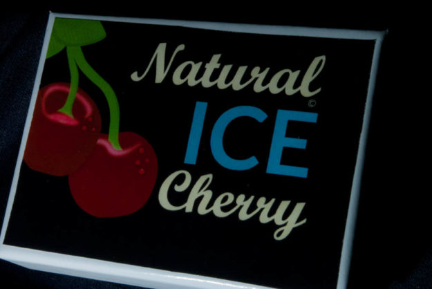
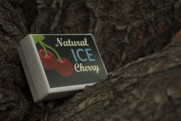
I still wasn’t getting the ice feel that I wanted. I decided to switch to a navy blue background and give the cherries more of a contrast. Also the ice blue color on the font helped to bring the cooled off look through and gave the product a completely different look. Here is my final product!
New Testament Infographic
The Process
Beginning
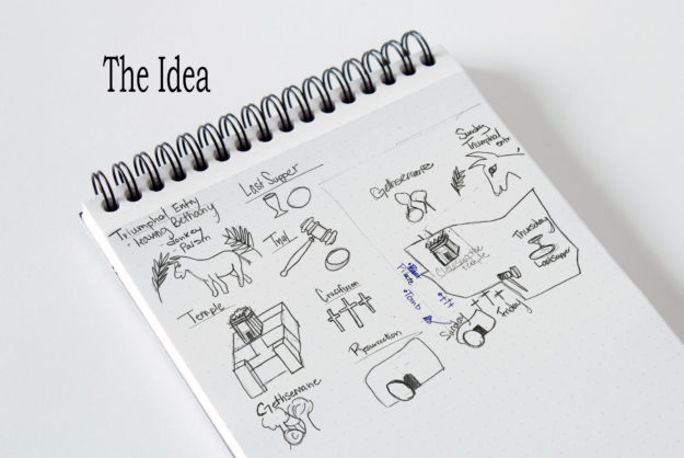
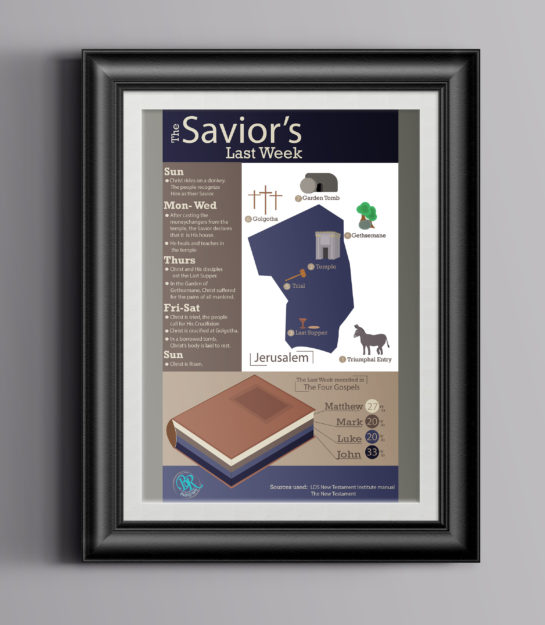
Building an info graphic has many different levels and calls for a lot of preparation and drafts. Coming up with idea was pretty easy on this project. I have been studying the New Testament lately and found a chart showing the last week of Jesus Christ’s life. The chart was a little hard to read and I wanted something that showed the graphics on the map of Jerusalem. With this in mind, I began to sketch. I started with a map of Jerusalem that I found in the back of the New Testament. Then I thought about the main events that took place that week. I then picked an object that showed the main part from each event.
Building the Graphics
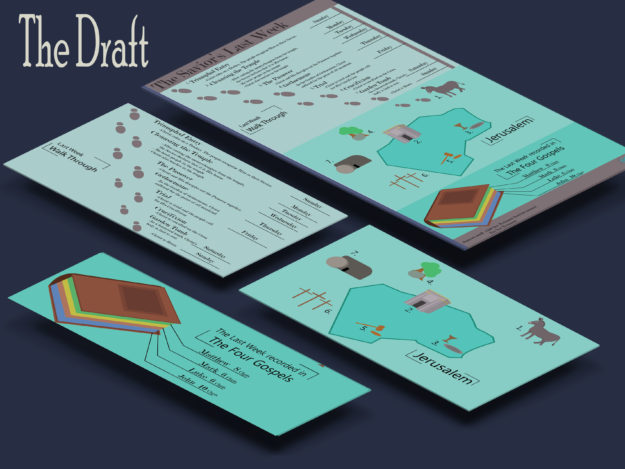
Next, I opened Adobe Illustrator and began designing the different objects. I worked on creating a style that was the same through all of the graphics. I wanted a 3-D element but not too realistic. I first just used lines and then worked to build lines with color and some shading. I also needed a graph that measures some data. I decided I wanted to show where you could find the events in the New Testament of the last week. I created a book and then showed who wrote the most about this week. To add more information, I decided to include a timeline of where Christ was throughout the week. I first had decided to build a top down timeline with the days of the week. When I put this together I knew it was just too much information. Here was my first draft. I liked all the parts, but I knew that I needed to reorganize it.
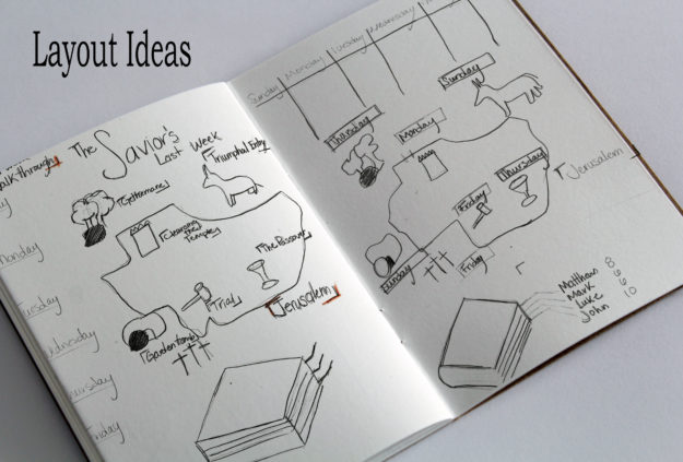
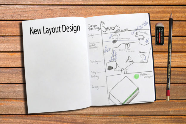
After talking with a few people and receiving a lot of advice, I went back to the sketch board and worked on different layouts. Below are some of the layout ideas I had.
Going back into illustrator, I worked on the overall layout. Here is what I came up with. I knew I needed to rework color, fonts, and some of the graphics, but the overall layout felt better and had more flow through out the entire graphic.
Design Choices
For the color scheme, I went to color.adobe.com and looked at different color schemes for the Bible. I still liked the gray aspect so I looked for scheme that had gray but also another bold color. The scheme I picked is called Pentago Bible Church.
For my fonts I used Myriad Pro and Rockwell. Myriad Pro is a Sans Serif font that I used for titles and contrast with the other text. Rockwell is a Slab Serif that contrasted well with the other fonts.
Finishing Touches
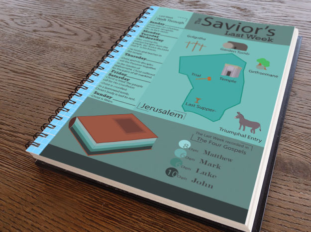
The last point I worked on use unifying the entire piece. I first worked on cleaning up a few of my graphics. I added depth to a lot of of them and changed placement with the titles of each place and added numbers to help direct the eye. Also I cleaned up my book graph and changed the numbers to percentages as well as added lines to help the viewer see the connection between the book and the numbers. Here is my final product.
The Final
Logo Design
Logo Designing
Designing a logo can be fun and challenging. You are looking for the right type of design to represent the business. This week I have been working on redesigning my logo. The business I have been designing for is my own, Brittany Reece Photography. I do a little bit of design, but my main focus is photography. A few years ago I designed my first logo. I wanted to communicate an old fashion, simple photography. I looked through different vintage cameras and chose a camera I wanted to work with. Then I focused on how to personalize it. I continued to simplify it through the last year and came up with a design that I feel really represents my business.
This past week I have worked on refining this logo to make it even better. I changed the font to become all caps on the Reece. I want this to work more effectively with the overall design of the camera. Also I wanted the shape to be not as odd. I took the black out behind the piece and then worked on making it more of a square instead of a rectangle here is my finished result.
I really like what this now communicated about my business. I feel the name is a bit more dominate because of the font choice. Also the bright red and black contrast well and help draw your eye to the logo.
A Second Choice
I also worked on coming up with a completely different logo this past week. The idea of putting aside the logo that has become apart of my name was really hard and I struggled leaving it and trying something new. I realized that I would have to go a completely different direction. I wanted to try something different but still with photography as the main idea. I began with sketching ideas that I had scene and how I could make it my own. Here is an example of some of the sketches I made.

As I was sketching, I really liked the idea of a circle and having a stamp on each of my photos.I liked the stamp idea to feel like I was putting my stamp of approval on each photo I produced. I decide this would be a great different type of logo. I then went into Adobe illustrator and began designing. I began playing around with different circles and placement. Here are some of my early drafts of potential logos.

From these three potentials, I really worked on developing the stamp and using design elements that would create something unique to my business. WIth colors I wanted a cooler color that wasn’t as loud as the first logo. I picked blues and grays to calm it down and have a different message. Here is the Logo I picked as my second choice.
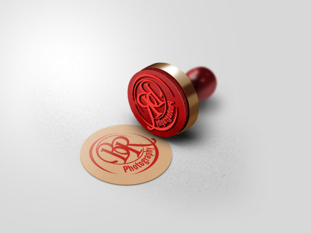
I chose a script font to make it more elegant and then a contrasting that is a lot more simpler. Here is a mock up of what this logo could look like.
I haven’t decided which logo I will ultimately use, but this stamp logo is becoming one of my favorites for sure.
