The Project
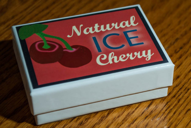
 Taking an existing product and creating a product redesign is a challenge. I didn’t know what product I wanted to do until I went to put some chapstick on. I then looked at my chapstick and started thinking through how I could improve the label and packaging. Here is the original packaging.
The Process
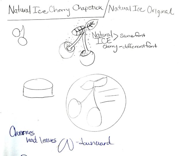
Beginning to think through this I began with sketching.
I knew at the beginning that I wanted to keep the cherries, but I wanted to clean up the colors and graphics by simplifying the overall design. I also wanted to change the packaging to a box with a short cylinder container. I also wanted to work on a different color scheme that would have more of a natural feel. Here is my design concept.
Fronts
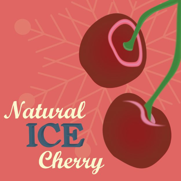
I wanted to create an interesting contrast between fonts. I chose Bookman oldstyle for the ice and body text and for the contrast with cherry I added in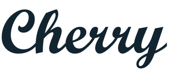 a readable script font called script MT. I wanted the ice lettering to give the feel of ice. I worked through a few different letters. I tried block letters, a white drop shadow behind the letters, and finally just decided to have a simple sans serif font bolded.
Color Scheme
Using color.adobe.com I looked for a muted cherry color type to help with the natural look. Here is a sample of the color scheme I chose.
The first draft
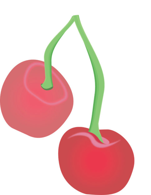
Here is my first layout of the cherries with and font. The feel was too complicated and I wanted to simplify it more.
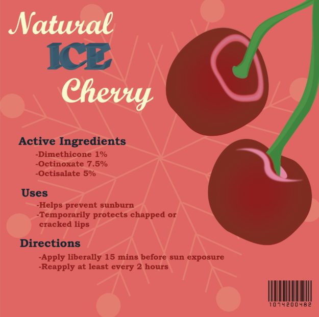
Here is my first print up of the design in simplified form. Working through a few more design rules, I wanted to have the overall appearance to standout more.
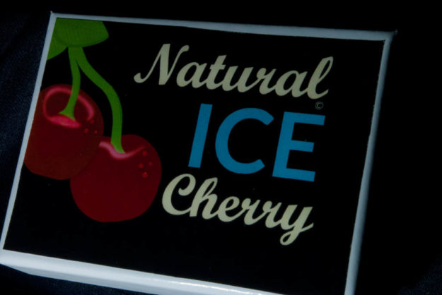
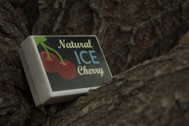
I still wasn’t getting the ice feel that I wanted. I decided to switch to a navy blue background and give the cherries more of a contrast. Also the ice blue color on the font helped to bring the cooled off look through and gave the product a completely different look. Here is my final product!
