The Process
Beginning
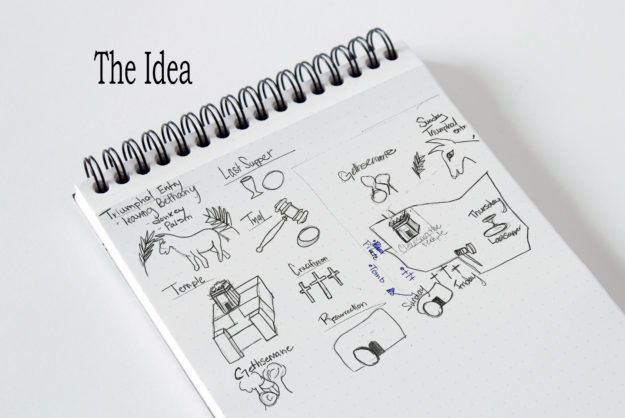
Building an info graphic has many different levels and calls for a lot of preparation and drafts. Coming up with idea was pretty easy on this project. I have been studying the New Testament lately and found a chart showing the last week of Jesus Christ’s life. The chart was a little hard to read and I wanted something that showed the graphics on the map of Jerusalem. With this in mind, I began to sketch. I started with a map of Jerusalem that I found in the back of the New Testament. Then I thought about the main events that took place that week. I then picked an object that showed the main part from each event.
Building the Graphics
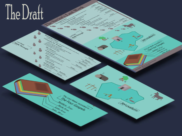
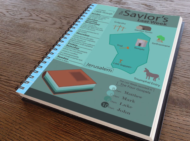
Next, I opened Adobe Illustrator and began designing the different objects. I worked on creating a style that was the same through all of the graphics. I wanted a 3-D element but not too realistic. I first just used lines and then worked to build lines with color and some shading. I also needed a graph that measures some data. I decided I wanted to show where you could find the events in the New Testament of the last week. I created a book and then showed who wrote the most about this week. To add more information, I decided to include a timeline of where Christ was throughout the week. I first had decided to build a top down timeline with the days of the week. When I put this together I knew it was just too much information. Here was my first draft. I liked all the parts, but I knew that I needed to reorganize it.
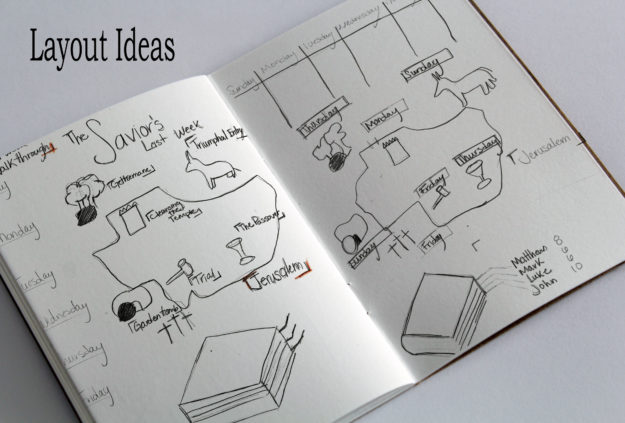
After talking with a few people and receiving a lot of advice, I went back to the sketch board and worked on different layouts. Below are some of the layout ideas I had.
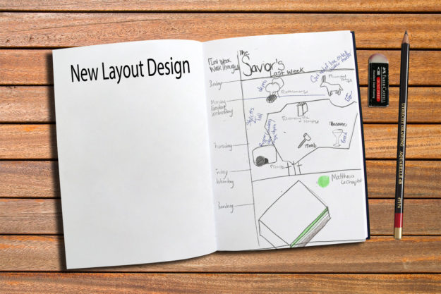
Going back into illustrator, I worked on the overall layout. Here is what I came up with. I knew I needed to rework color, fonts, and some of the graphics, but the overall layout felt better and had more flow through out the entire graphic.
Design Choices
For the color scheme, I went to color.adobe.com and looked at different color schemes for the Bible. I still liked the gray aspect so I looked for scheme that had gray but also another bold color. The scheme I picked is called Pentago Bible Church.
For my fonts I used Myriad Pro and Rockwell. Myriad Pro is a Sans Serif font that I used for titles and contrast with the other text. Rockwell is a Slab Serif that contrasted well with the other fonts.
Finishing Touches
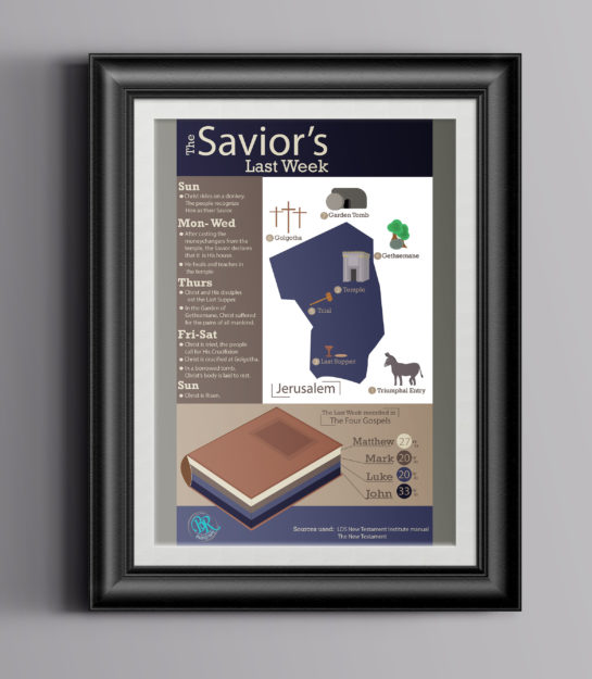
The last point I worked on use unifying the entire piece. I first worked on cleaning up a few of my graphics. I added depth to a lot of of them and changed placement with the titles of each place and added numbers to help direct the eye. Also I cleaned up my book graph and changed the numbers to percentages as well as added lines to help the viewer see the connection between the book and the numbers. Here is my final product.
The Final
